CASE StuDY
Kahua Pacific Kitchen
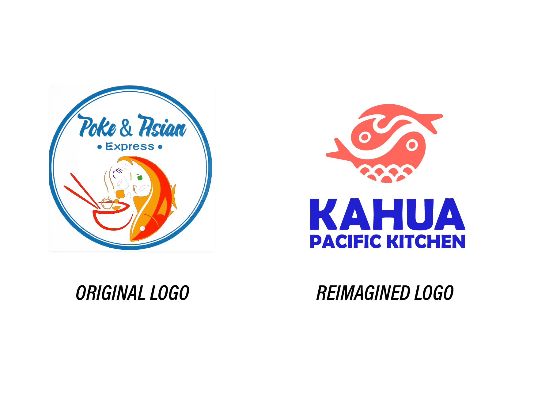
Hawaii Poke & Asian Express is a franchised fast casual restaurant with a popular location in Corpus Christi, Texas. In partnership with co-designer Hameen Reynolds, we completely reimagined the brand as Kahua Pacific Kitchen; conceptually focused on integrating Japanese and Hawaiian cultural design influences in a way that was accessible, exciting, and inviting to a South Texan audience.
the face of the brand
The focus of this logo design was to modernize the face of the brand and create a visually appealing and memorable logo experience.
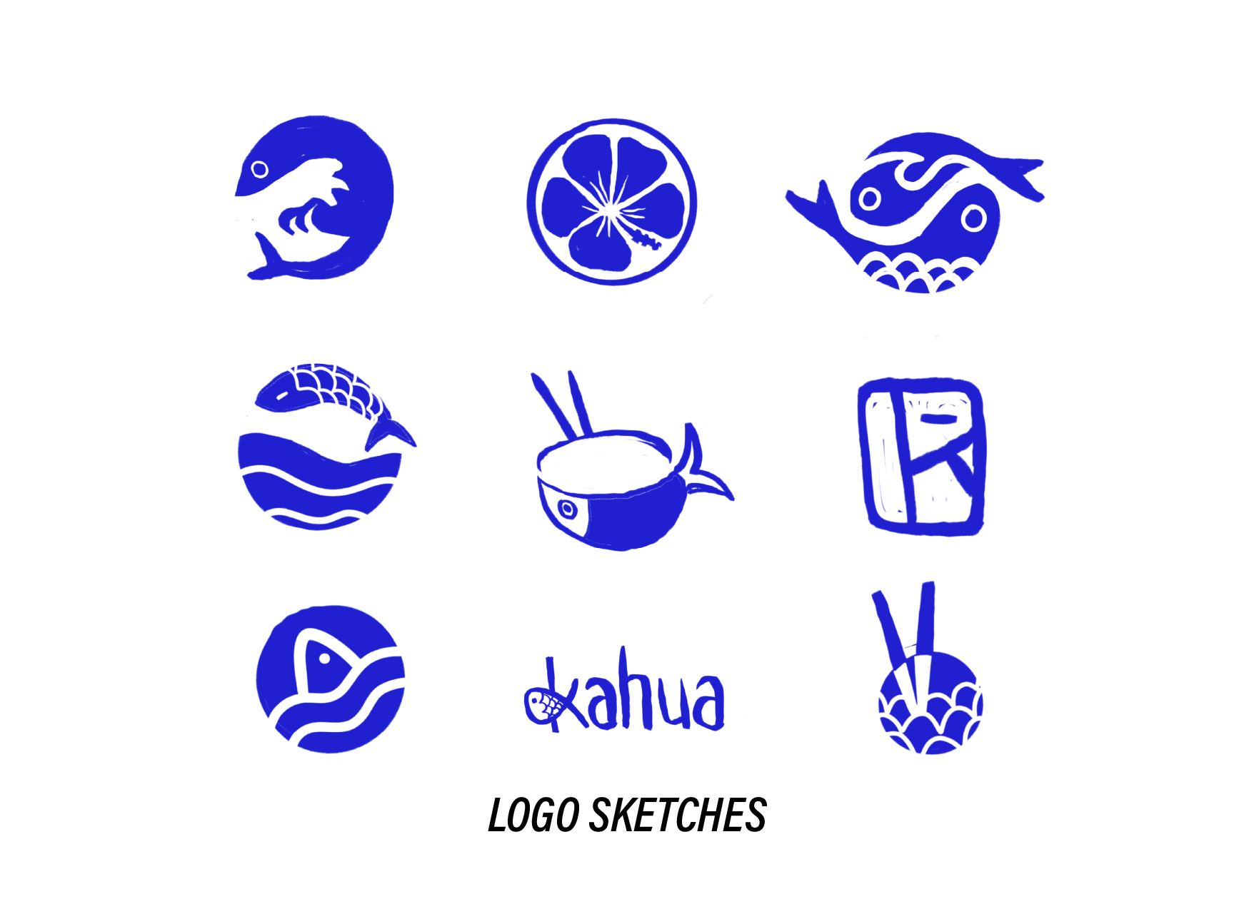
We wanted to represent the restaurant’s food products in an unexpected way, drawing visual inspiration from the circular geometry of bowls, cups, rice, and even the unexpected circles found in fish, shrimp, waves, and other organic forms.
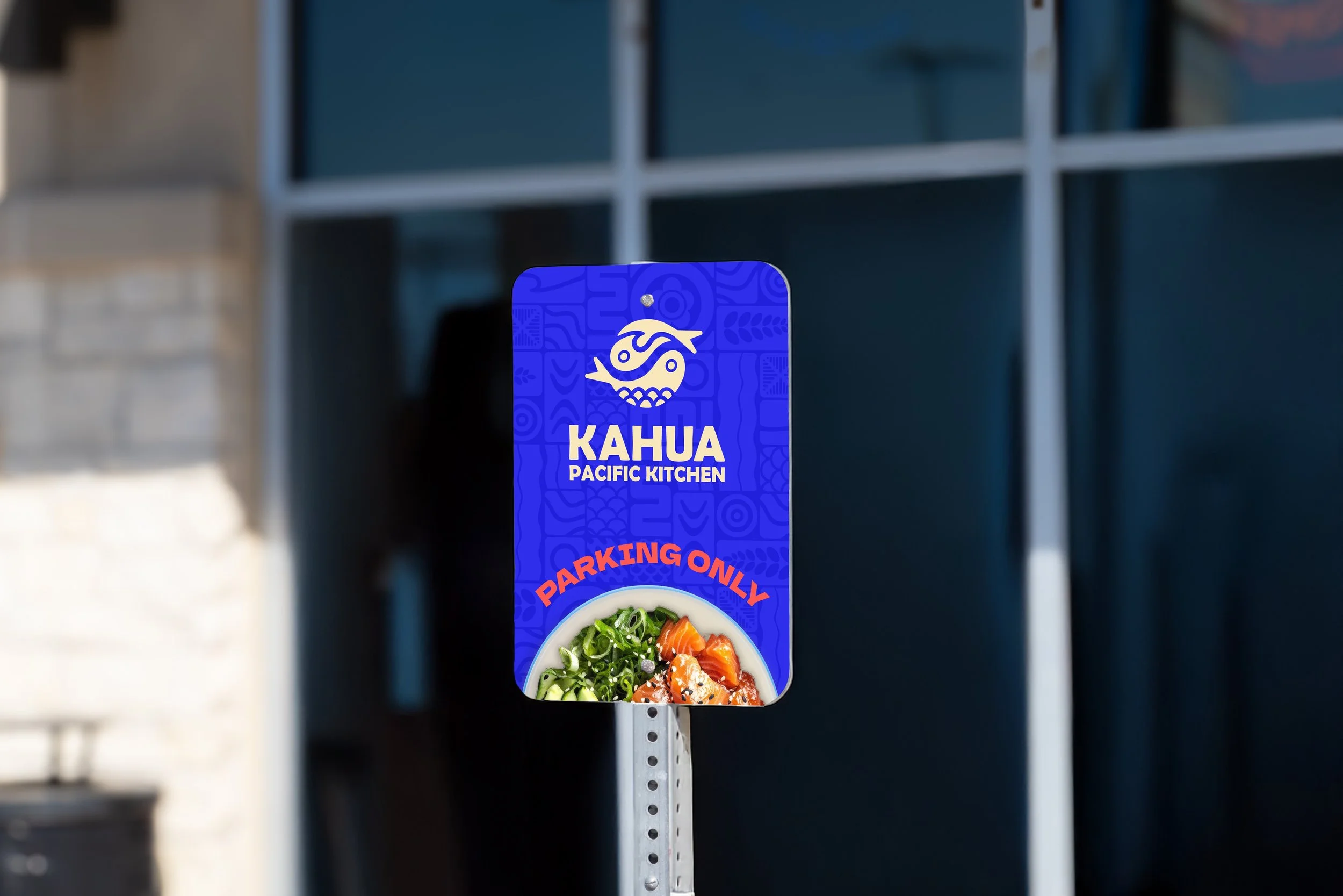
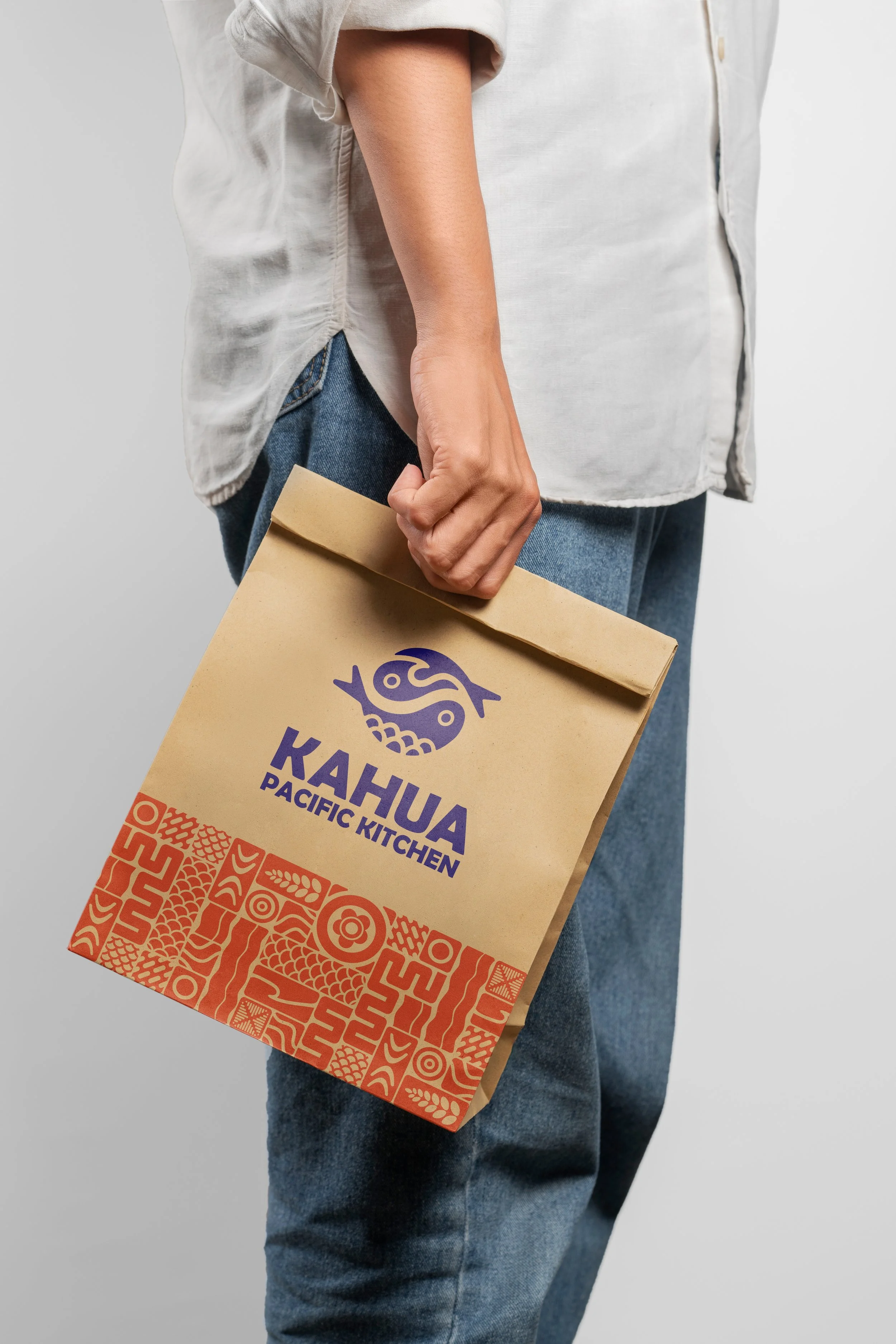
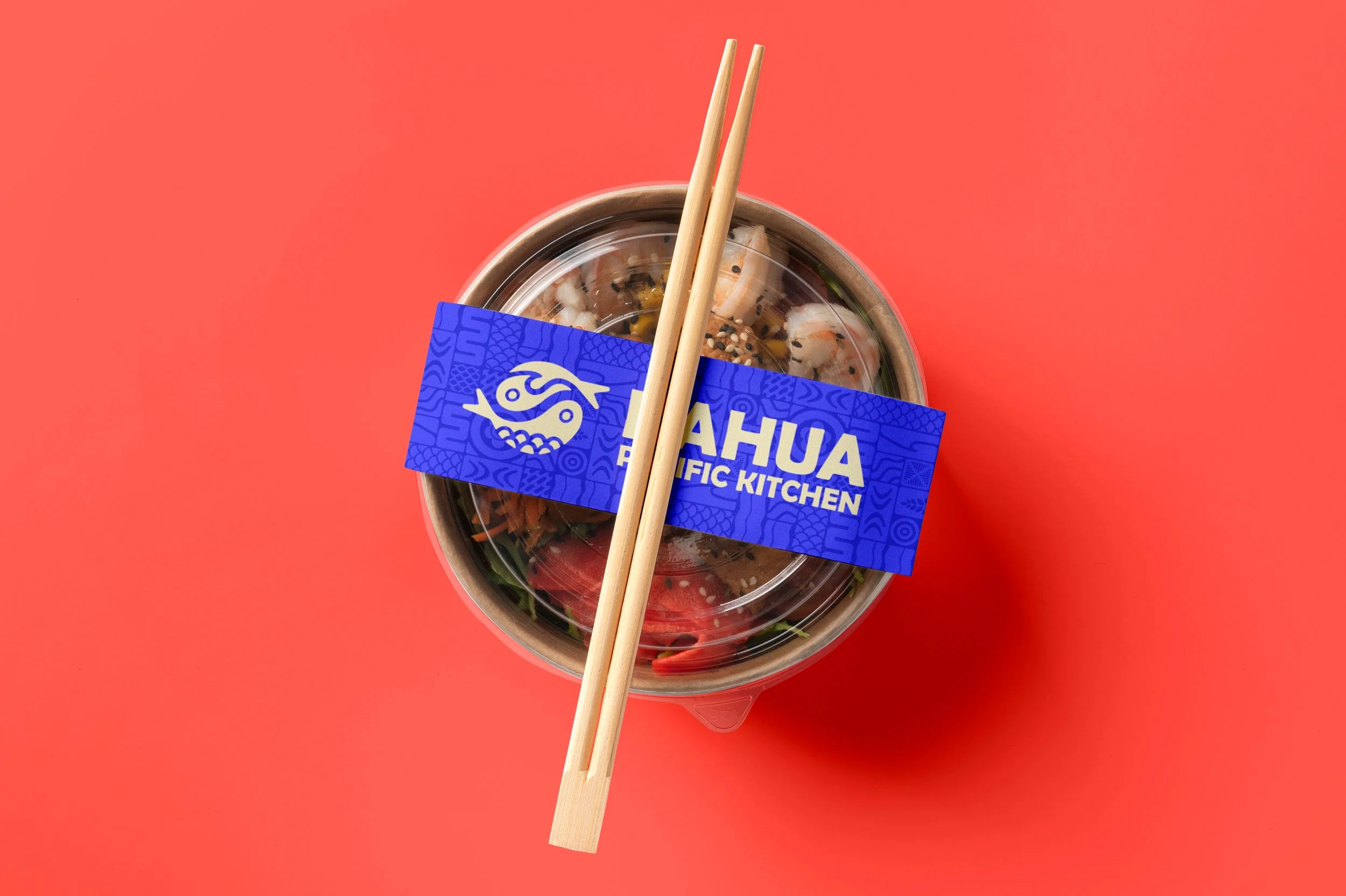
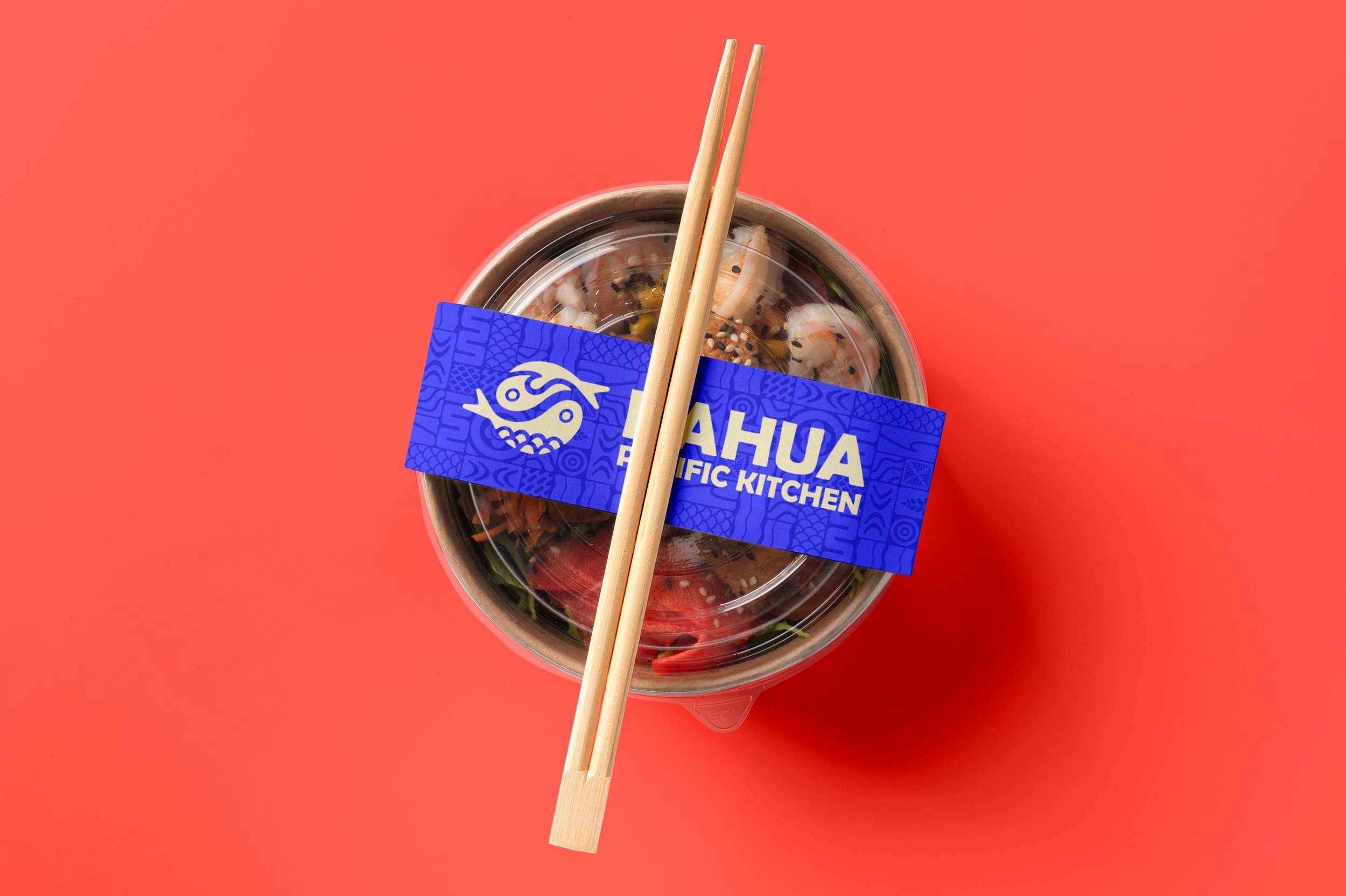
The chosen logotype shows two fish intertwined in a yin and yang symbol, a Japanese visual motif representing harmony, peace, and balance, with embedded lines reminiscent of a wave crashing over a bed of grains of rice.
developing a signature
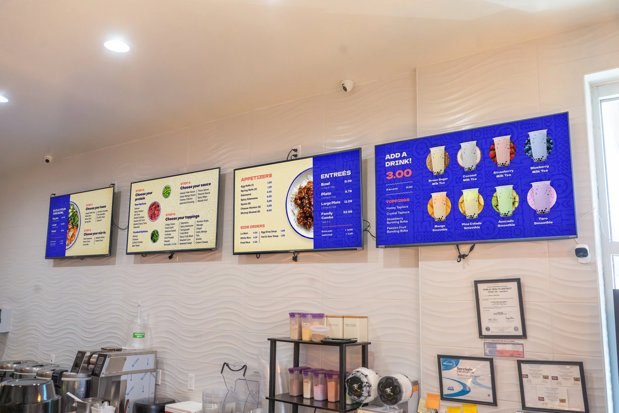
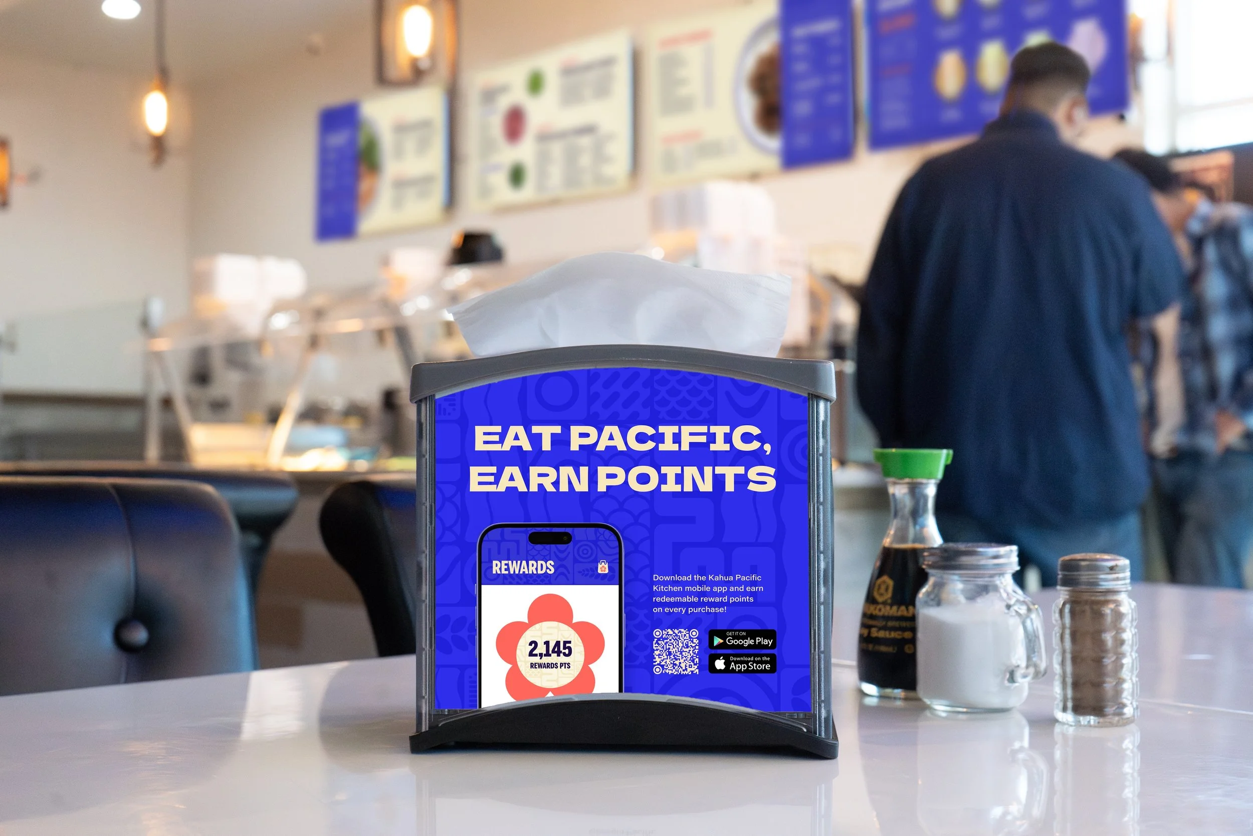
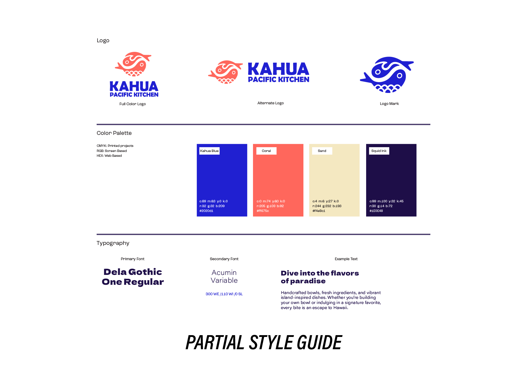
This project required a lot of different deliverables. One of our goals was to create a unifying element that could be incorporated across multiple touchpoints and provide an easy way to identify the brand identity. Considering Hawaiian and Japanese textile and art traditions, a pattern was an easy choice. We pulled inspiration from Japanese bento grid design and Hawaiian floral and geometric pattern design to create Kahua Pacific Kitchen’s unique pattern, incorporating visual elements of food offerings and pieces of the logo design.
REALIZING THE VISION
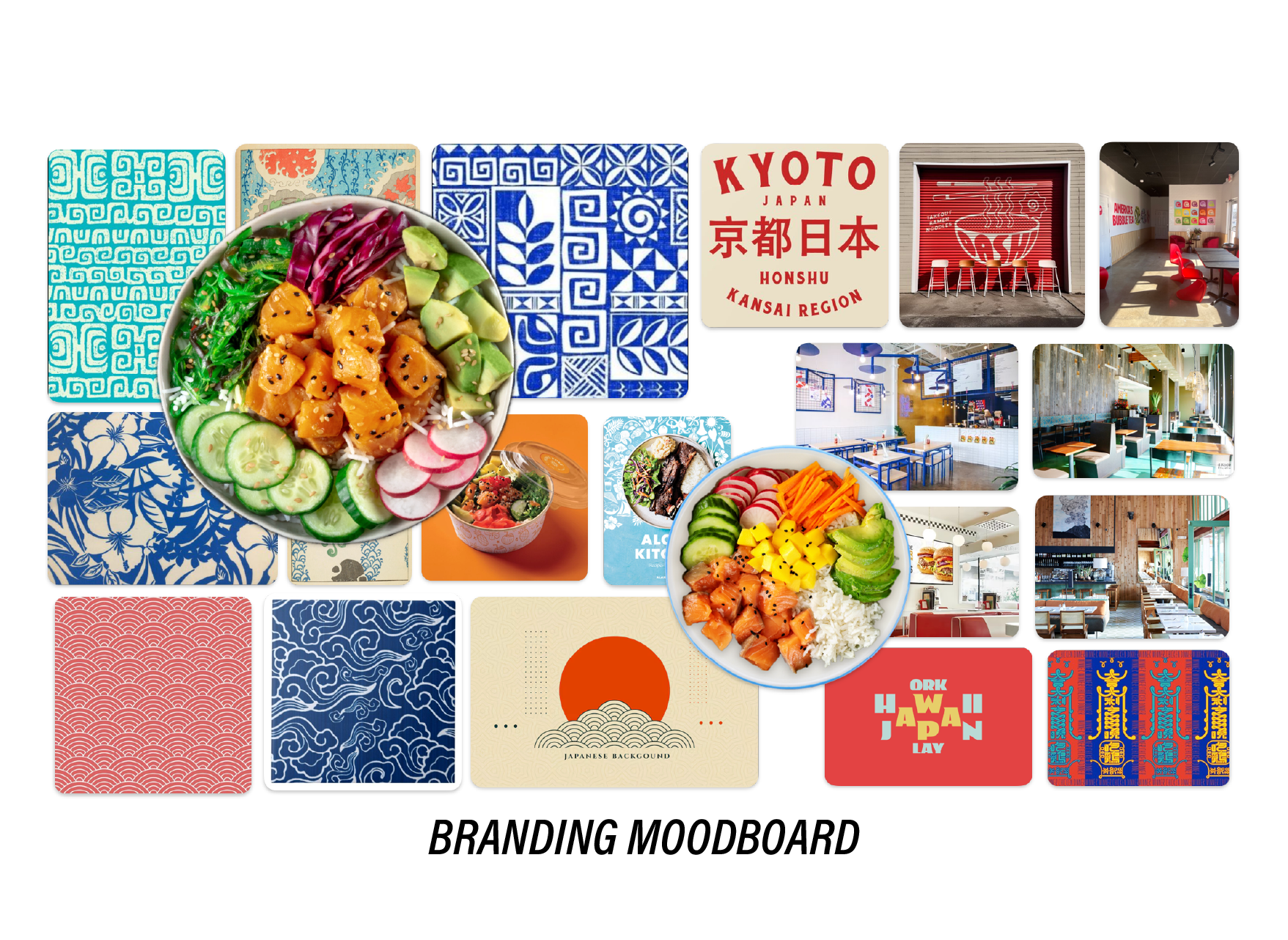
As residents not of Hawaii or Japan, but Texas, we wanted to be as conscious as possible of playing with cultural elements in a smart and respectful way. We collected visual resources and inspirations from Japanese and Hawaiian art and pattern tradition, restaurant design, popular food branding, and architecture.
We wanted this new brand to engage with a South Texan audience in a fun, vibrant, and approachable way, so instead of getting too formal or historical in our cultural influences, we gravitated towards a contemporary, bright, and poppy solution.
adjusting the language
From renaming the brand from Hawaii Poke and Asian Express to Kahua Pacific Kitchen, we were able to bring the brand closer to a cultural touchpoint through the use of the Hawaiian language; ‘kahua’ translating to ‘courtyard’ or ‘meeting place’, an appropriate name for a food court style restaurant.

consistency is key
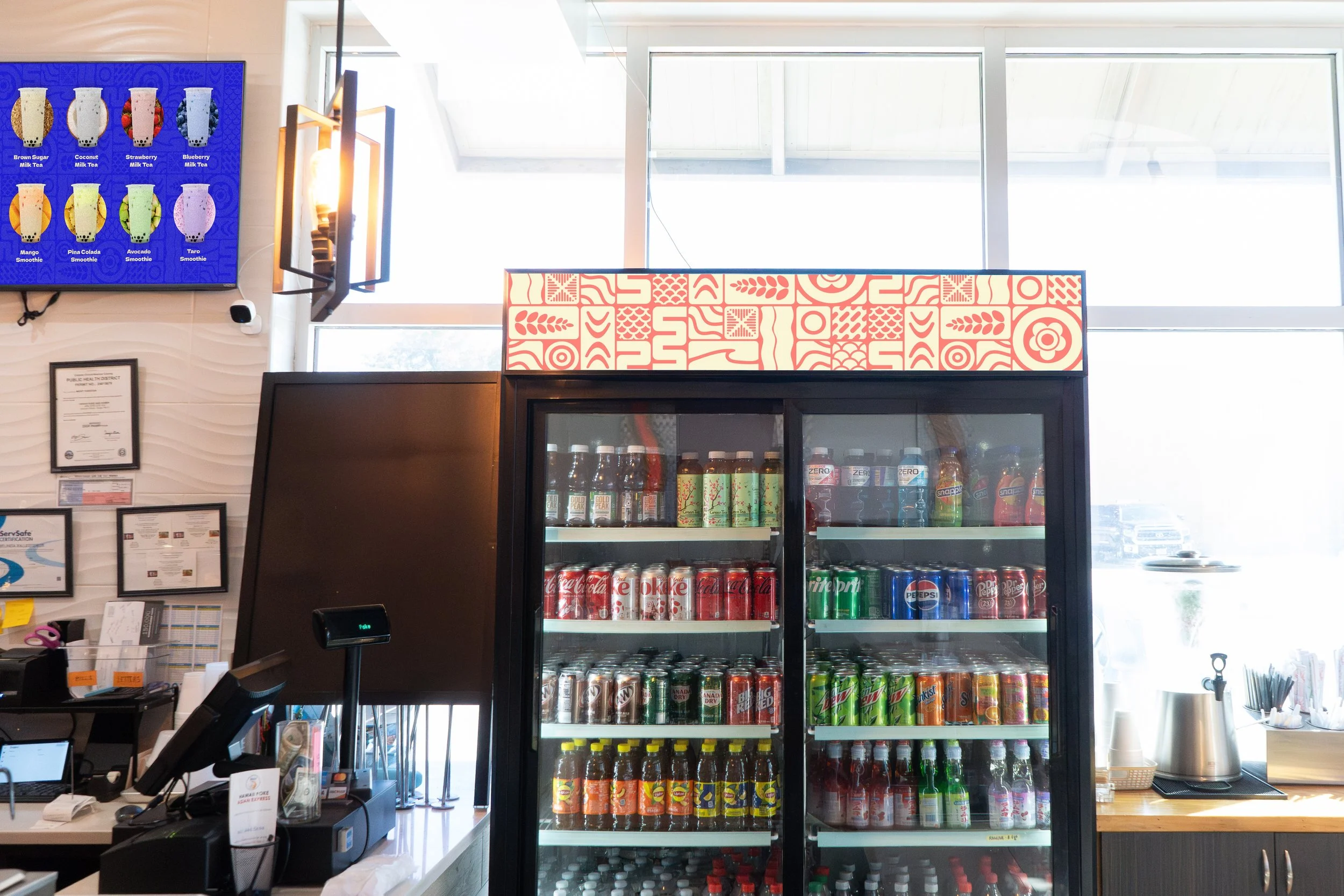
As with any brand design, but especially with one shared by multiple designers, our biggest effort was in remaining consistent in brand application and decisions across a plethora of different deliverables. A consistent style guide was developed, but we also created a library of images and a series of textural guidelines so that we could control as many of the visual variables as possible.