CASE StuDY
sprawl magazine
Sprawl Magazine is a travel and lifestyle magazine focusing on the visual beauty of Earth’s architectural wonders and their intersectionality with the beauty of nature. Issues are released quarterly, with each focusing in on a different travel destination and exploring travel tips, local hot spots, cultural phenom, and travel lifestyle articles. This issue of Sprawl explored the delight of Grecian design influence; dreamy colors, geometric tiled patterns, and architectural illustration in a love letter to the Greek isles.

the face of the brand
The main publications I looked at during ideation were AFAR, Travel and Leisure, Conde Nast’s Traveler, and Architectural Digest. All of the magazines I looked at may occasionally feature illustration, but aren’t features of any house style. This became one facet of the identity I could fit myself into. I also realized that most travel magazines were pretty utilitarian – here’s a destination, here’s where to stay, here’s what to bring – and I wanted to take a bit more of an aspirational approach to Sprawl, mixing the appreciation of beauty with something that could be genuinely useful.
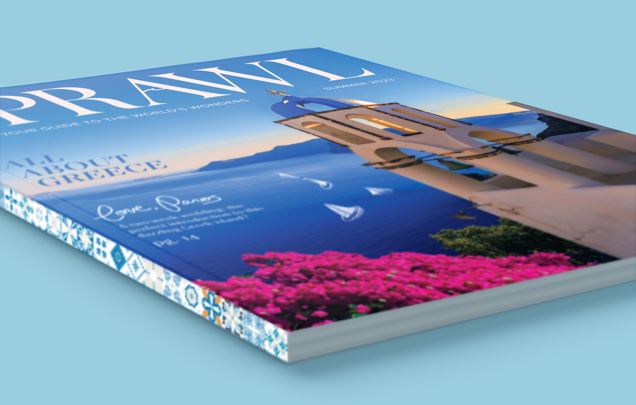
don’t judge a magazine by its cover
Cover design is everything, especially in publication design. Once a masthead design is implemented, the perfect photographic backdrop must be found. This cover features the visual style of one of the featured stories found within, complete with a nod to the multimedia illustration style and a bold headline declaring this issue is all about Greece.
love, paros
Featured story Love, Paros, originally a Magster article We’ll Always have Paros by Andrew Sean Greer, is a fantastic read and an endless well of visual inspiration. For this story, I wanted to feature the author and his partner as illustrated characters, interacting with a photographic Paros, Greece as the article takes a leisurely tour around the island. The title spread features other illustrated artifacts – a string of drying octopi mingling with hung laundry, a line of glass coke bottles, a troop of seagulls in teh distance – creating a whimsical effect that welcomes you into the author’s world.
REALIZING THE VISION
I developed a large library of visual inspiration leading up to the development of Sprawl. With such a long-form project, a main challenge is making sure that your work stays consistent from the beginning to the end of the workflow. I wanted sets of visual inspiration for several categories – illustration, photography, typography, color – so that throughout the process of creating, Sprawl would flourish under the same vision that it sprouted from.

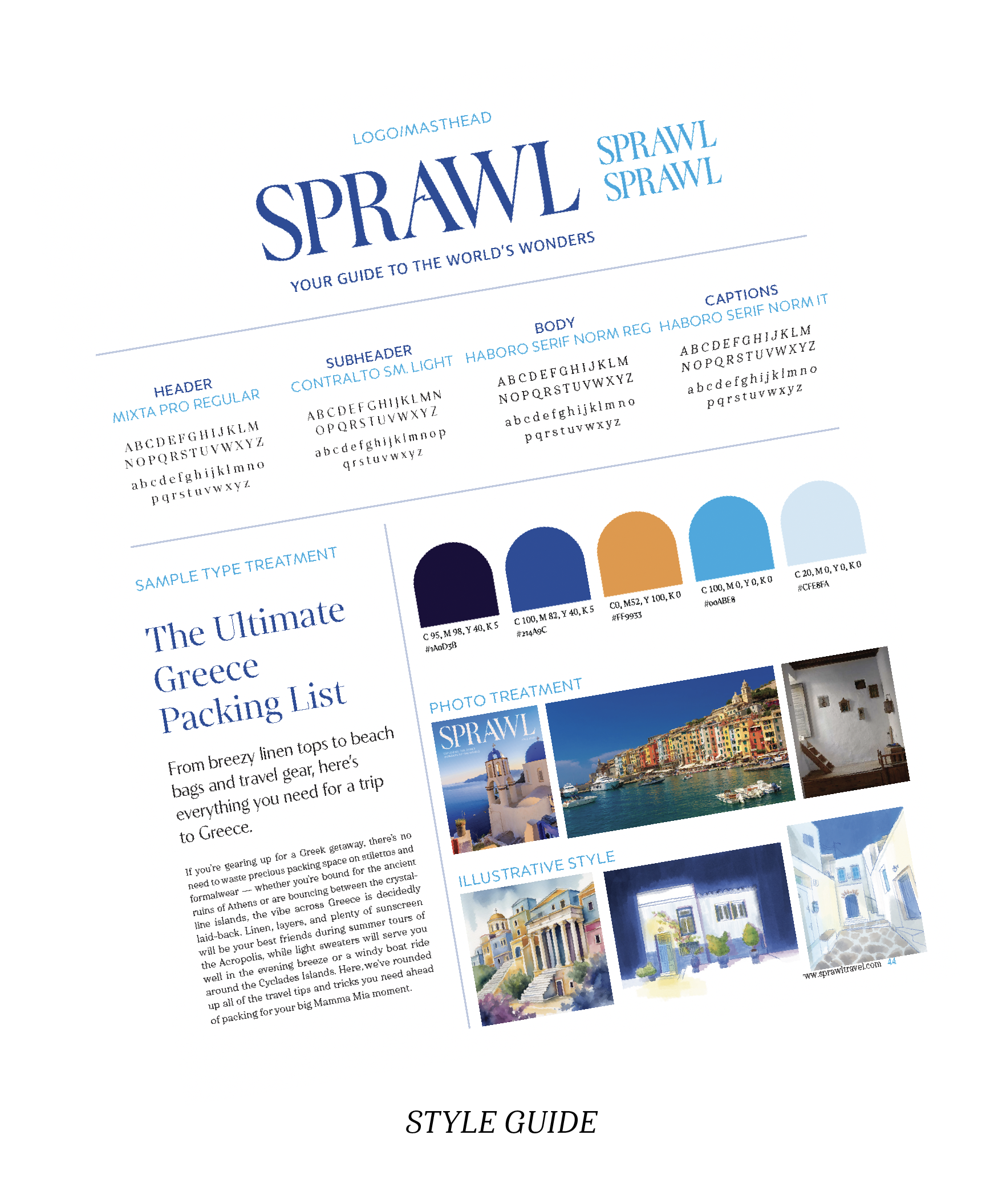
Setting the style
In order to create a strong and successful editorial system, you need a typographic system that can stand the test of many column widths, type sizes, and caption margins. After undergoing a rigorous series of type experiments, I compiled the winning system alongside a charming Grecian color palette, curated photographic and illustrative guides, and a dynamic masthead to create Sprawl’s style guide.

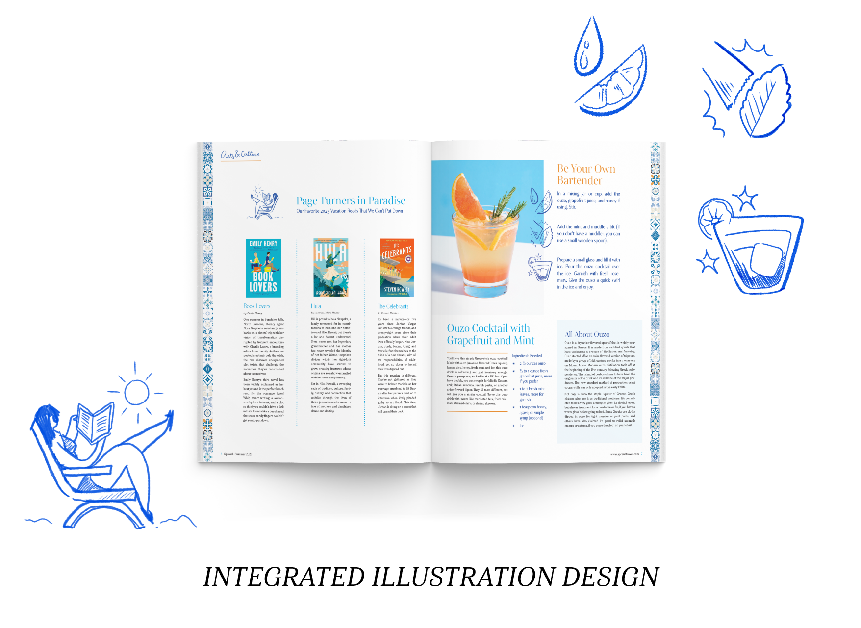
Cartoons can be classy!
Throughout the front and back briefs, small ink illustrations tastefully ornament some of the stories. These illustrations were developed as part of Sprawl Magazine’s house style, a differentiator between them and other travel and architecture magazines in its space. These digital illustrations are purposefully loose and sketchey, inspired by book-margin doodles and (early draft) architectural sketches.

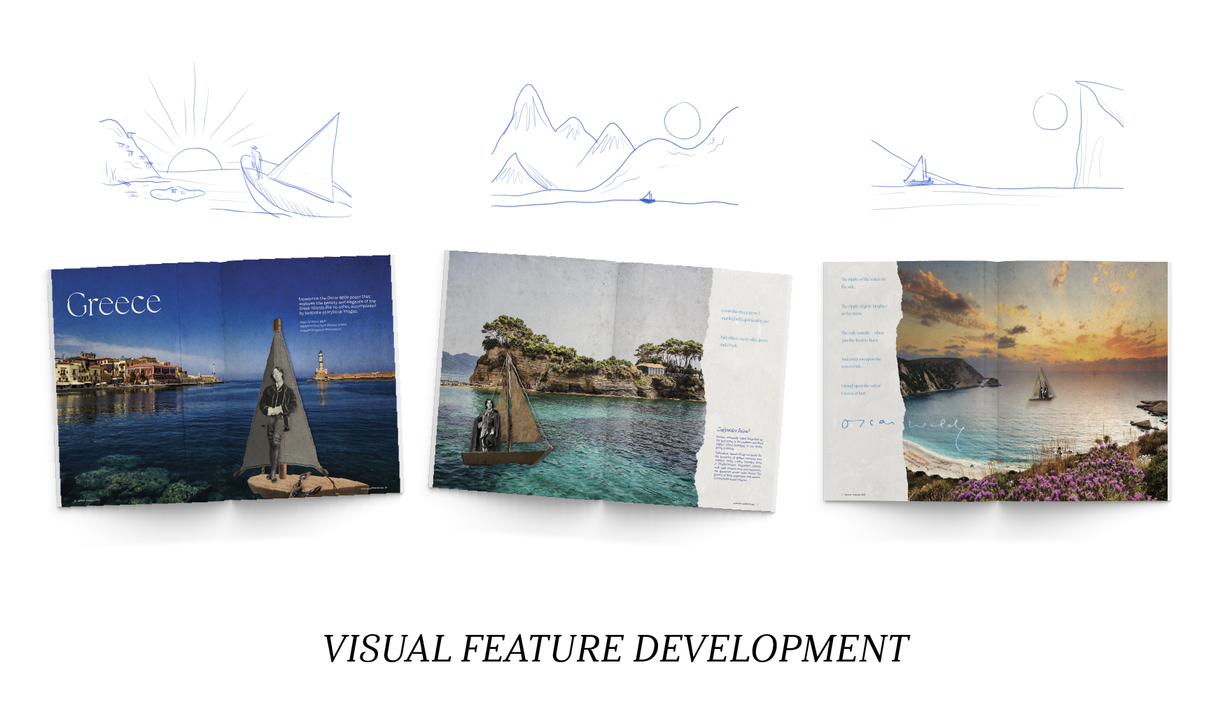
greece in the eyes of the wilde
Here’s something shocking – there is a surprising lack of long-form travel content about Greece available on the open internet! I decided to take a slight left turn for my visual featured story and turn to a poem by Oscar Wilde, pairing each stanza with information about the isle he describes. I created digital collages of the author sailing through each island, hoping to capture both the joy for travel described by Wilde and the beauty of the islands he sails through.